Presentation design, branding, and editorial infographics.
Every piece here started the same way: a conversation about the audience, the takeaway, and the one thing the work has to land.
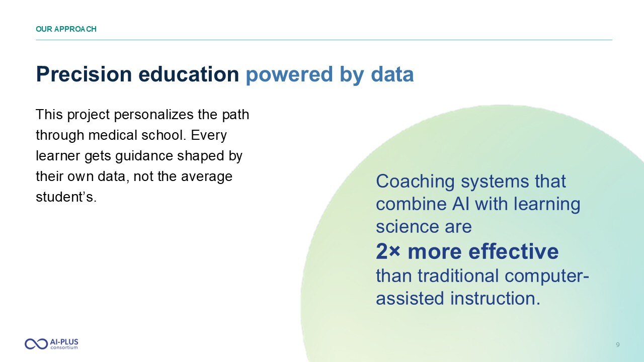
AI-PLUS: a national medical education consortium project
A complete brand and presentation system for a fifteen-institution medical education consortium.
The work started with the grant proposal, past decks, and interview notes. The story came first, shaped for academic partners and funders. The brand, guidelines, and slide system followed.
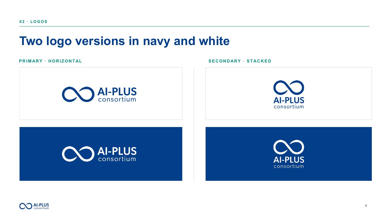
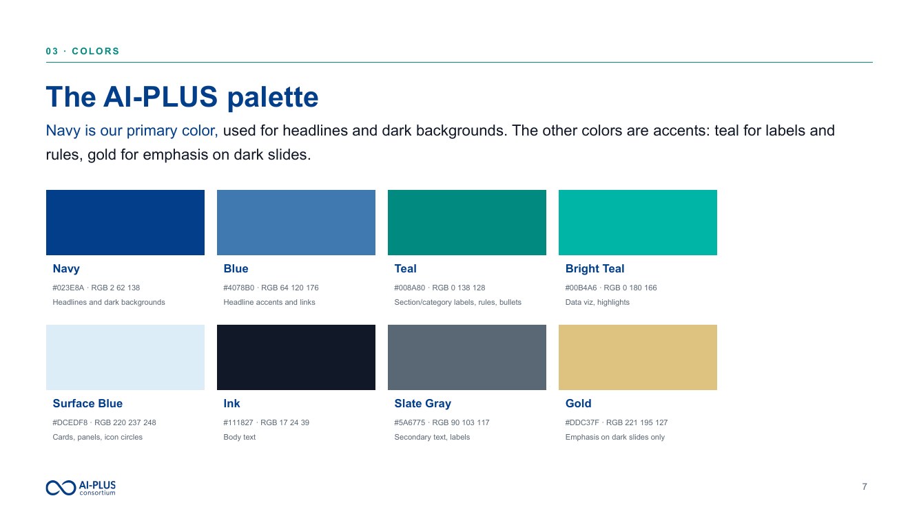
Brand identityLogo, color palette, typography, and visual motifs, built to stand apart from the member institutions.
Brand guidelinesColor, type, iconography, layout, and usage standards for consistent work across the consortium.
Kickoff presentationThe original PowerPoint reworked into a clear narrative for the consortium's introduction.
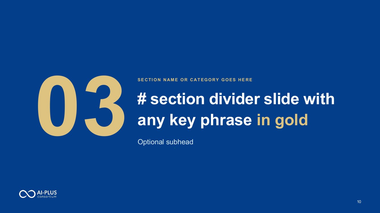
Reusable template34 editable slides, 24 master layouts, and copy-and-paste elements, built for non-designers.
Logo systemColor systemTemplate layouts
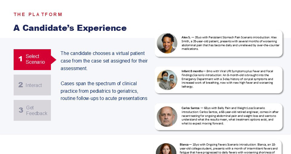
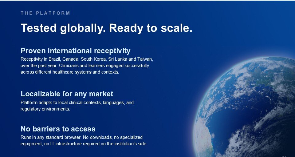
Pitch deck for an AI-powered clinical assessment partnership
The deck moves step by step from problem to solution. Each section earns the next, so the room stays with the story.
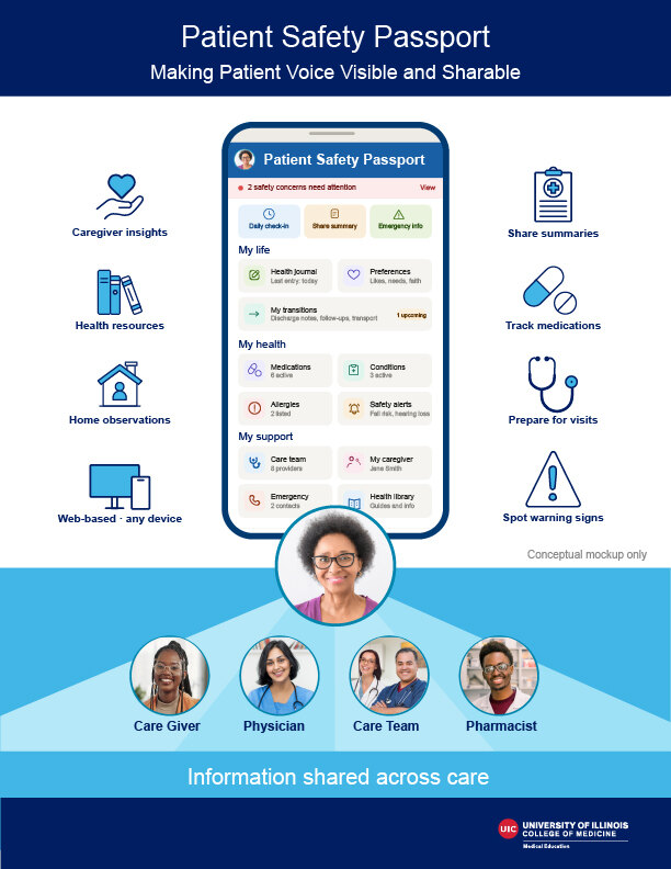
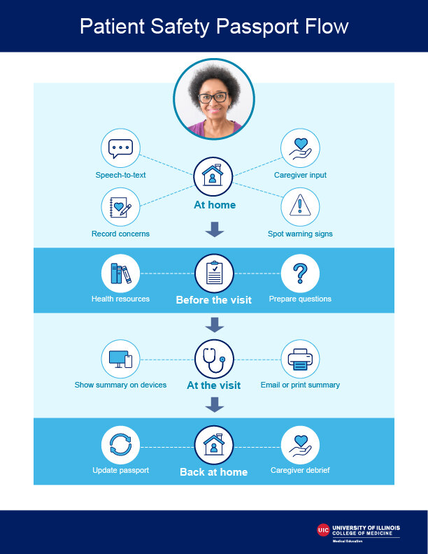
Patient Safety Passport: a tool for older adults navigating care
A visual for a grant proposal. The tool it explains improves communication and helps older adults move more safely between hospital, clinic, and home.
Two pages get it across in a minute: iconography, plain language, and a simple workflow.
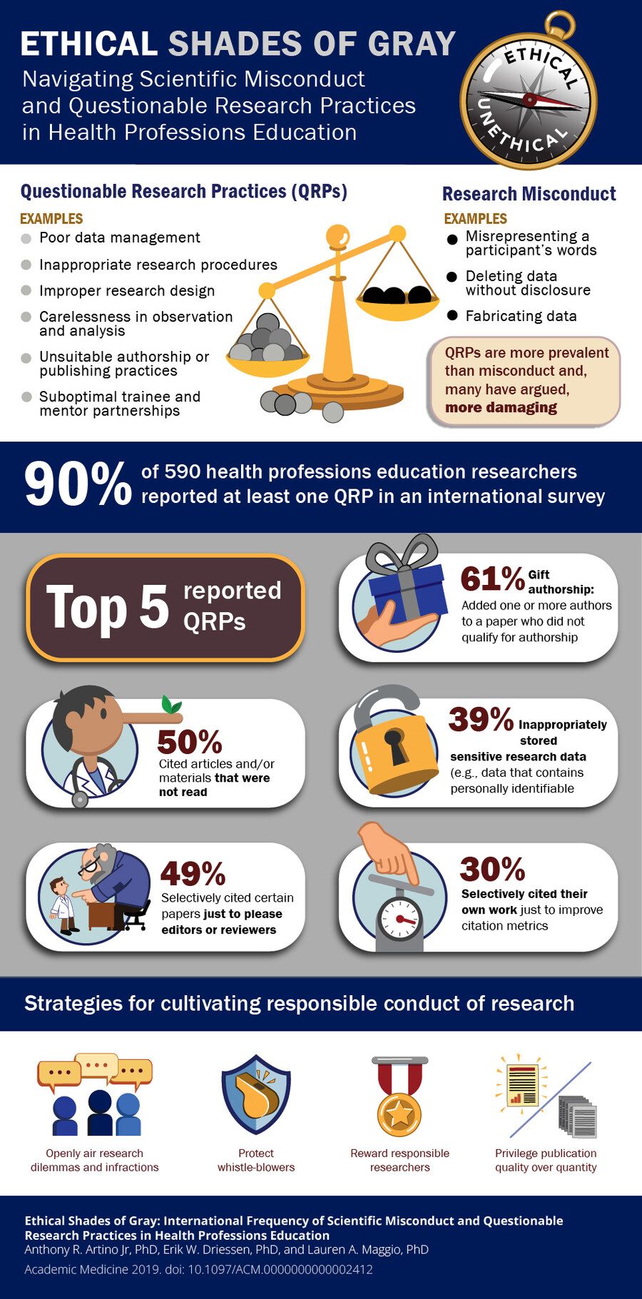
Ethical Shades of Gray: an Academic Medicine infographic
For an Academic Medicine article on research misconduct and questionable research practices.
Custom illustrations bring humor to a serious subject. Readers scan it in a minute and remember it.
Something complex that needs a clear story?Let’s talk